|
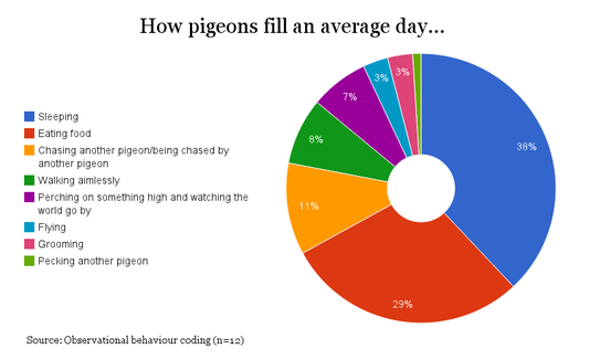
I thought it might be helpful to provide a quick concrete example of good data visualisation practice. Following my last post, my mind naturally returned to the topic of pigeons and, amazingly, a quick Google search threw up a useful example. The following donut chart comes from www.londonpidgeons.co.uk and I think it provides a useful case study of some of the simple changes that can be made to allow a data visualisation to more effectively communicate its message Issues with this visualisation include:
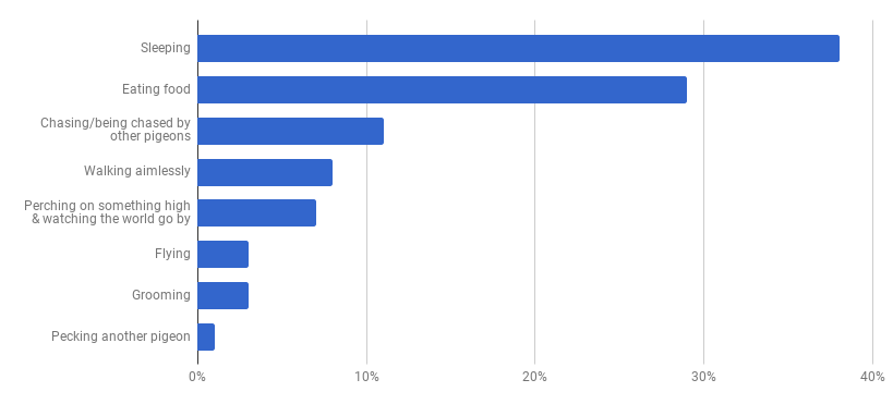
I’ll admit that I may be taking this pigeon analysis a bit too seriously, however, it is still the case that a simple bar chart would have communicated this information much more effectively. To make my point I created the following in Google Sheets in about 2 minutes: At first glance you may think that this doesn’t have the same visual appeal as the donut, however, our objective is communication and you can certainly read the data much more clearly in this bar chart than you could from the donut chart above. The 2 simple reasons for this are:
Nothing is a given in data visualisation though and so if you disagree then please get in touch.
0 Comments
|
ABOUT MEAll content & opinions are those of the author Archives
July 2020
Categories |
|


 RSS Feed
