Graphic Insight - Data Visualisation Training & Consultancy
  • Home
  • Training
  • Events
  • Ideas
  • About Me
  • Contact

Thoughts, Notes & Ideas

Visualising Pigeons and Donuts - A Case Study

14/6/2018

0 Comments

 
I thought it might be helpful to provide a quick concrete example of good data visualisation practice. Following my last post, my mind naturally returned to the topic of pigeons and, amazingly, a quick Google search threw up a useful example.  

The following donut chart comes from www.londonpidgeons.co.uk and I think it provides a useful case study of some of the simple changes that can be made to allow a data visualisation to more effectively communicate its message
Picture
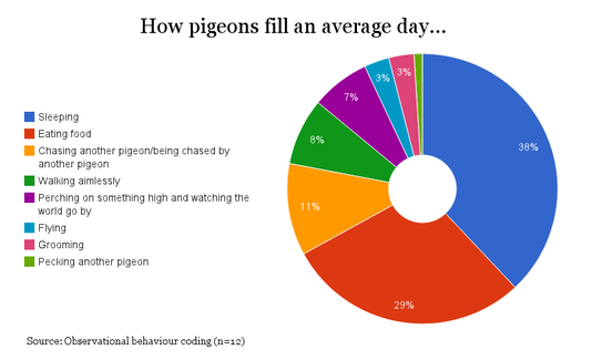
Issues with this visualisation include:
  1. Humans are not good at comparing the relative size of pie/donut chart segments - It is very hard for our brains to compare the relative sizes of each segment.  We are very good at unconsciously judging differences in attributes such as length and position but we are poor at judging the scale of differences in area, angle or arc.  This is an oversimplified argument but knowing about the “pre-attentive attributes of visual perception” is fundamental to understanding how to create an effective data visualisation
  2. The capacity of our working memory is limited - There are too many segments, which makes the visual too noisy and the contrast of colours difficult to judge. A good principle here comes from the Psychologist George Miller’s seminal paper in 1956 entitled ‘The Magical Number 7, Plus or Minus 2’; our working memory is general limited to holding about 7 pieces of information at any one time.  Based on this it is unreasonable to expect someone to be able to easily make judgements across these 9 segments while remembering what each of them means.
  3. The legend takes up too much space - Edward Tufte offers the very helpful advice to “above all else, show the data”. Based on this, the presentation of the data itself should always dominate a visualisation and the legend
  4. There’s reason to suspect that we should not trust this data - We must always cast an analytical eye over any data visualisation and a quick look at this throws up a couple of reasons to suspect that something is wrong with the data analysis within this chart.  For example, the sample size is only 12 and I’m not sure that those 12 pigeons are representative of the behaviour of all pigeons in London

I’ll admit that I may be taking this pigeon analysis a bit too seriously, however, it is still the case that a simple bar chart would have communicated this information much more effectively.  To make my point I created the following in Google Sheets in about 2 minutes:
Picture

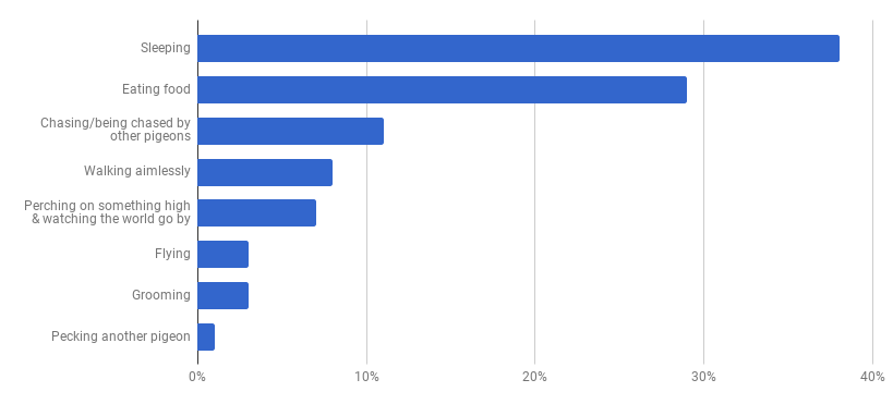
At first glance you may think that this doesn’t have the same visual appeal as the donut, however, our objective is communication and you can certainly read the data much more clearly in this bar chart than you could from the donut chart above.  The 2 simple reasons for this are:
  1. We can easily judge the differing length of each bar
  2. We can easily read which bar related to which behaviour

Nothing is a given in data visualisation though and so if you disagree then please get in touch.
​

0 Comments


Leave a Reply.

    ABOUT ME

    All content & opinions are those of the author

    View my profile on LinkedIn

    Archives

    July 2020
    September 2019
    February 2019
    December 2018
    June 2018
    May 2018
    April 2018

    Categories

    All
    Books
    Data Visualisation

    RSS Feed

Picture

Graphic Insight
​is a data visualisation training and consultancy provider run by Dan Isaac FCCA

Contact Dan via e-mail at D.J.Isaac@exeter.ac.uk
© COPYRIGHT 2018
  • Home
  • Training
  • Events
  • Ideas
  • About Me
  • Contact