
I can’t remember where I first heard this quote but it’s one of the most useful tips I’ve ever received. I regularly find myself passing this pearl of wisdom on to anyone who will listen and if you’re reading this then I want you to remember it as well. The operating system of the human mind is highly visual. If I were to ask you to think of a pink elephant, you will likely create a kind of faint impression of a pink elephant within your mind and this impression will be very much visual rather than verbal or auditory.  However, while our minds and thoughts tend to operate visually, too often we rely solely on verbal language when communicating our ideas and this often leads to unnecessary misunderstandings. Sketch your ideas Before any report or data visualisation is developed, you first need to understand the requirement. How clearly that requirement can be defined plays a huge role in how effective the final product will be. Even at this early stage in our design process you can improve communication by creating images to share ideas. Now you may be thinking that creating a visual representation of your ideas is too time consuming. However, it really doesn’t have to be and my advice here is to “sketch, sketch, sketch”. This approach was initially inspired by a presentation I saw a few years ago by Nigel Hawtin (see http://nigelhawtin.com/). Sketching is quick and easy and you won’t become attached to your first drafts in the same way that you would if you’ve spent ages pulling a visualisation together using an IT tool. Using a pencil and paper it can take a matter of minutes to turn your ideas into images that will help both you and your audience to better understand and agree your requirements. Building on this shared understanding, your drawings can become the foundation of your design as they go through multiple iterations. Eventually you'll find them coming to life with real data as you build the final visualisation in your chosen IT tool. I'll be honest, I can’t draw. My artistic expression is limited to scribbles and stickmen, but that’s fine. As the old Chinese proverb says “a picture is worth a thousand words”. Over the years, I’ve found my child-like sketches to be an invaluable part of my process for agreeing reporting requirements and designs.  So remember the wisdom of Steve Jobs - if you want to get your message across quickly and clearly then don’t just ask people what they want, show them what they can have.
0 Comments
I thought it might be helpful to provide a quick concrete example of good data visualisation practice. Following my last post, my mind naturally returned to the topic of pigeons and, amazingly, a quick Google search threw up a useful example. The following donut chart comes from www.londonpidgeons.co.uk and I think it provides a useful case study of some of the simple changes that can be made to allow a data visualisation to more effectively communicate its message 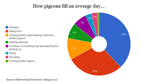 Issues with this visualisation include:
I’ll admit that I may be taking this pigeon analysis a bit too seriously, however, it is still the case that a simple bar chart would have communicated this information much more effectively. To make my point I created the following in Google Sheets in about 2 minutes: 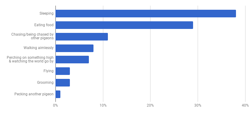 At first glance you may think that this doesn’t have the same visual appeal as the donut, however, our objective is communication and you can certainly read the data much more clearly in this bar chart than you could from the donut chart above. The 2 simple reasons for this are:
Nothing is a given in data visualisation though and so if you disagree then please get in touch. The benefits of effective data visualisation can be substantial. My concern is that good practice is often just equated with use of the latest tools. Flashy visual gimmicks are usually a distraction from our ultimate aim. Q: What should our ultimate aim be when creating a data visualisation? A: An efficient presentation which effectively communicates its intended message. So the purpose of data visualisation is communication. With this in mind, let’s consider the purpose of communication and cut that back to basics. Q: How do we effectively communicate our intended message? A: By clearly stating and presenting the message in a way that your audience can understand. This isn’t rocket science, but when we consider what constitutes effective communication, it is certainly not the tools we use that come to mind. Whether we are communicating verbally, by phone, by e-mail or using a carrier pigeon, it is the form and content of the message that determines whether it will be clearly understood by its intended audience. While we need to understand how to use our tools, it is not the tools that determine the quality of our message.  Carrier pigeon (not actual size) Back to data visualisation and the same applies. In order to communicate effectively with data, we need to know our tools but, most importantly, we need to know how to communicate our message.
Writers like Edward Tufte, Stephen Few and Alberto Cairo have provided great insight into the cognitive aspect of data visualisation. Their ideas aren't well-known outside the field and even amongst data visualisation practitioners, they are often neglected. I’d like to change that. I’m fascinated by the psychological aspect of data visualisation. If we are going to communicate our message effectively then we need to understand how our audience will perceive and comprehend the information that we present to them. Data visualisation is the front line between data and decision making We should be aiming to make the transition of information from page/screen into our readers’ brains as seamless as possible. To do this well, we all need to know the science and psychology behind effective data visualisation. Some examples:
Tools like Excel, Tableau, Qlik, Cognos or Power BI and languages like D3, R or WebGL will allow you to create a vast array of different visualisations but they will never be able to tell you how to most effectively communicate your message. Data visualisation tools and languages are constantly evolving and it is obviously important to know your tools and to be aware of technical developments within the field. However, this will always be secondary to knowing the value of, and methods behind, effective communication and so I’d encourage everyone to find out as much as they can about the theory behind their craft. If you’d like to know more then please get in touch! |
ABOUT MEAll content & opinions are those of the author 
Archives
July 2020
Categories |

 RSS Feed
|
|
|