Everyone is talking about AI, but people aren’t talking about the humans that use AI and the data that fuels it. In this post, I aim to correct that by discussing:
A (Very) Brief History of AI; From Sci-fi to ChatGPT… I am not an AI expert and so this will not be a discussion of the technology behind AI; instead, I will be considering AI from a layman’s perspective. Until recently, a layman’s understanding of AI largely came from science-fiction and ideas about dystopian realities in which humans struggle to live alongside superintelligences and killer robots. These stories often involve a ‘general AI’ exhibiting human-like intelligence that somehow becomes conscious, starts setting its own goals and inevitably wreaks havoc. We have not seen the emergence of ‘general AI’. We have instead seen the steady development of ‘specific AI’; tools focussed on solving specific and clearly defined problems. Until recently, the only actual AI that we were aware of was developed to play games like chess, go or Jeopardy. The Turing Test encouraged the development of AI tools that processed language in a way that appeared human, but this was still a closed problem with a well-defined goal. Over the last couple of decades, the development of machine learning has led to emergence of algorithmic decision-making and the possibility of rapidly efficient processes that no longer require direct human input. As impressive as these tools were, they were far from perfect. The use of bad quality data feeding poorly understood algorithms has led to error and injustice in various corners of society, as outlined by Cathy O’Neil’s ‘Weapons of Math Destruction’. On 30th November 2022, ChatGPT was unleashed on the world. Since then, we’ve seen an explosion of interest in the potential for AI to solve our problems and make us more efficient. However, ChatGPT is still a ‘specific AI’ tool. It is a large language model designed to process huge volumes of text and output useful content based upon the prompt we have provided. ChatGPT and the similar generative AI tools that have followed (e.g. Gemini, Copilot, Apple Intelligence etc.) are changing the world, but they do not work in isolation. To work well, they need good data, and they need humans that understand them and their limitations. AI & HumansAI tools support humans in achieving their goals. A primary goal for all human endeavour is the pursuit of wisdom. Wisdom is developed from our knowledge of the world; our knowledge comes from the information that we consume and that information is the product of the data on which it is based. This DIKW (Data > Information > Knowledge > Wisdom) pyramid is a helpful reminder that our goals do not lie within the data itself but in the process of turning that data into wisdom. However, a key challenge in this process is turning information, which exists as pixels on a screen or ink on a page, into knowledge, which exists as neurons firing inside our brains. As a data visualisation expert, I like to explain that the human visual system offers this bridge from information to knowledge and I encourage everyone to develop their understanding of how our brains process information that is presented to us though graphs, tables, images or text. We’ll now consider how humans can interact with AI to develop their collective knowledge through a process known as distributed cognition.
The concept of distributed cognition invites us to consider a technology and its user as a singular system. We cannot evaluate the efficiency and effectiveness of AI tools without also evaluating the humans that are using these tools. Technology-assisted humans are more powerful at processing information and making decisions than humans, or technology, alone. As an example, take a moment to consider the power of numerical processing as we increase the technology available to a person:
We can consider AI as a metatool. It doesn’t do anything useful in isolation, but it can make all the other tools we use more powerful. For this to be the case, we must understand the role of the human as well as the AI. Prompt engineering is emerging as an important topic in supporting humans in using GenAI tools. People need to understand what these Large Language Models can and can’t do. They also need to understand how to prompt to give the outputs that genuinely meet their desired goals. As an example of this, Microsoft use the acronym GCSE to guide us writing effective prompts when using its GenAI tool, Copilot; this encourages us to ensure that our prompts define our Goal, Context, Source & Expectations. A key question at the heart of the interaction between humans and AI is “Should we trust AI?”. Humans are very inconsistent in the levels of trust in algorithms. We will blindly follow a sat-nav that risks taking us down one-way streets or into canals, yet we struggle to entrust our journey to a driverless car (even though they can be shown to be safer than human drivers). However, to understand if we should trust AI we need to consider if we can trust the data it is based on. AI's Data ProblemThe importance of the phrase, “Garbage in, garbage out”, cannot be overstated. Any tool, system or process, must be considered as involving 3 distinct steps:
AI offers an incredibly powerful process; however, this process can only feed from the data available to it and the quality of its outputs can only ever be as good as (or worse than) these inputs. With this in mind, we clearly need our AI to be built upon good data, but how do we define ‘good’ data? ‘Good’ data is not always easy to identify by either humans or AI. Take this example, taken from a tweet from Jon Schwabish in June 2020. Donald Trump had tweeted this: At first, there doesn’t appear to be anything wrong or misleading about this. It’s a simple dataset of only 5 data points and Trump is correctly claiming that May-2020, towards the end of his first term, was a record month in seeing the most job gains in recorded history. It is only when you reflect on what was happening in the world at the time that you can begin to see the issue with this data. Here’s the same data but with the previous month included too: Given the context of the Covid-19 Pandemic, and the fact that more than 20m job were lost from the US economy in Apr-2020, Trump’s gain of ~2.5m jobs no longer seems as impressive as he is claiming. This is an example of ‘cherry-picking’ data to make a point that is not the truth of the broader dataset. Another example of misleading data comes from the fact that correlation does not necessarily equate to causation. As this example from Tyler Vigen’s Spurious Correlations shows; just because two datasets correlate does not mean that 1 causes the other. These are just 2 examples of ways in which seemingly ‘good’ data can be misleading and we cannot expect AI to identify the problems with these datasets. AI cannot access ‘truth’, it can only access data and this means that it will inevitably output the same bias that is contained within the data it is processing. As concluded by this UN article on Racism & AI, “Bias from the past leads to bias in the future” . However, as shown by the notorious incident in which Google Gemini began generating images of black and Asian Nazi soldiers, there is no easy fix, and attempts to correct the AI algorithms rather than correcting the data, can easily lead to an overcorrection. This leads us to the challenge of Availability Bias. For humans, what you see is all there is, or “WYSIATI” as Daniel Kahneman described it. This rather obvious point highlights the fact that we can only make decisions-based on the information available to us and are blind to incorporate any perspectives of which we were not aware. This is why it is important to refer to a broad range of information, opinions and perspectives before making any significant decision. For AI, the data is all there is. AI tools do not have access to any ‘truth’ beyond the data available to them. Availability bias can take various forms including:
Countering bias is a very difficult thing to do. However, the first step towards overcoming bias is to be aware of our own bias. When making decisions, all humans should reflect on their biases, the biases of the people they interact with and the biases contained within the data they work with. ‘Good’ data reflects the reality of the world around us and is free from bias. However, this will not happen organically and requires a significant financial and cultural investment by any organisation that utilises data (i.e. all organisations!). As a precursor to the successful utilisation or AI, an organisation must have a Data Strategy that incorporates and embeds established good practice in:
All modern businesses understand the value of data as an asset. Technology giants and recent startups have developed within a content in which these technical requirements for ‘good’ data have are becoming the norm. However, for ‘legacy’ organisations, this presents a massive hurdle. Much of the data held in ‘legacy’ systems by traditional organisations, is not machine readable and so cannot be utilised by AI. This may be because the data is incomplete, inconsistent and/or siloed. If data is not held in a complete and consistent format, with keys that are common across tables, and databases that are accessible to one another, then it cannot be utilised by AI. Addressing this challenge presents huge costs to ‘legacy’ organisations; however it cannot be ignored and must be tackled before any attempt at enabling AI. A further challenge for all organisation is the knowledge gap that exists between AI/Data Professionals and Business Leaders. Business Leaders are not aware, and cannot be expected to be fully cognizant of technical challenges of working with data to enable AI. As a result of this, organisations can fall prey to “Magpie Syndrome” where the pursuit of shiny new AI toys ignores the data transformation that is required to enable these tools. To address these concerns we obviously need better data, but we also need more data literate humans. Humans need Data LiteracyThere is a significant challenge facing humans when utilising data. Put simply, we are lazy, and while data can reflect the world at the incomprehensibly complex place that it is, we just want our decisions to be simple. Modern human history has seen exponential growth in technology, but evolution has not allowed our minds to develop at the same pace. As Stephen Pinker states in ‘How the Mind Works’, “The mind is a system of organs of computation, designed by natural selection to solve the kinds of problem our ancestors faced in the foraging way of life, in particular, understanding and outmanoeuvring objects, animals, plants, and other people”. Our minds, which are primarily adapted to a hunter-gatherer way of life, have been thrust into a complex world of technology, data and AI. We cannot be expected to know how to successfully navigate this world without a help and this is the reason we must all work to develop our data literacy. Data literacy is a concept that lends itself to multiple interpretations. However, put simply, it is the ability to:
- Numerical skills - IT skills - Analytical skills - Subject matter knowledge The importance of this has been stressed by Jain Piyanka who said that “everybody needs data literacy, because data is everywhere. It’s the new currency, it's the language of the business. We need to be able to speak that.” A core component of data literacy involves nurturing the 3 Cs of: · Curiosity · Creativity · Critical thinking These are necessary tools that all humans possess and that we must fully exercise when utilising data. A key component of this is asking questions. When it is time to make a decision, always ask… What does the data tell us? And then ask: · Who provided this data and/or created this visualisation? · What was the intention of the data provider/report designer? · What is the data source? · Is the data complete? · Is the quality of the input data sufficient for the decision being made? · What analysis/transformation has been applied to the data? While data literacy is accessible to all humans, it is not intuitive and must be learnt. Just one example of the way in which numeracy, as a core component of data literacy, is not intuitive to humans, consider the bat and ball problem. A bat & ball cost £1.10, the bat costs £1 more than the ball, how much does the ball cost? In considering the answer to this question, your gut instinct is likely to offer an answer of 10p, as that is what feels right. It’s only when you engage some higher-level critical thinking that you realise the answer is in fact 5p. For more examples of the limitations of intuition when applied to decision-making, the book ‘Thinking, Fast & Slow’ by Daniel Kahneman offers an invaluable resource. Kahneman outlines two types of thinking:
The challenge facing human beings in making decisions is that we are lazy and will try to avoid using system 2 thinking where possible. You should now be able to see the problems that this can cause. To become data literate, humans must embark on a training and development programme that incorporates the following elements:
In my role as the University of Exeter’s Data Literacy & Training Lead, my time is now focussed on developing the tools and resources needed to facilitate this. Conclusion - Towards AI Literacy? It is important that we acknowledge the risks of AI, because, as outlined by the French Philosopher Paul Virilio - “The invention of the ship was also the invention of the shipwreck… Every technology carries its own negativity, which is invented at the same time as technical progress.” However, the risks of AI are not just about killer robots, and they are not risks that can only be solved by technological experts. The main risk we face in using AI is that poor quality data and untrained humans will encourage AI to produce biased and ineffective outputs that will result in unjust and inappropriate outcomes. In the face of these risks, utilising AI requires a paradigm shift for all of us. We need to fundamentally change the way we work and the questions we ask of the tools we use. More specifically, we need better data and we need more data literate humans. Epilogue - AI Vs Human This blog post has been developed from a presentation I delivered at the University of Exeter’s AI Symposium on 20th March 2025. The 45-min presentation was entitled “Garbage In, Garbage Out: The Importance of Data Literacy in Utilizing AI” and I’d created 34 Powerpoint slides and a 766 word document of rough notes outlining the structure, themes and messages that I aimed to deliver through the spoken presentation. The blog post above took approximately 5 hours to write based on the materials described. I also shared my notes with Microsoft’s Copilot using the following prompt and it created it’s own version of my blog post in about 5 seconds. I’m sharing this as a direct comparison of the capabilities of AI and Humans in developing the same output and invite you to consider the value-added by each approach. Prompt:
Rewrite the content in <<20250320 Rough Notes from AI Symposium Talk>> as a blog post. It should be 1500-2000 words long and written in a positive, friendly and human voice. The overall goal of the blog is to highlight the importance of (a) understanding a human's role when evaluating AI, (b) highlighting AI's data problem and (c) humans' need for data literacy. It should conclude with a simple summary highlighting the main points raised. Output: Garbage In, Garbage Out: The Importance of Data Literacy in Utilizing AI Introduction Welcome to our discussion on the crucial role of data literacy in the age of artificial intelligence (AI). While AI has become a buzzword, it's essential to remember that behind every AI system is a foundation of data. As a data expert, I want to emphasize the importance of understanding the human role in evaluating AI, addressing AI's data problem, and fostering data literacy among individuals. Let's dive into these topics and explore why they matter. The Layman's Perspective of AI AI has come a long way from the realms of science fiction to becoming an integral part of our daily lives. In the past, AI was often depicted as a terrifying superintelligence, as seen in Nick Bostrom's "Superintelligence." These stories usually involved general AI, which is conscious and capable of setting its own goals. However, the reality of AI today is more grounded in specific AI, designed to solve particular problems. Until recently, AI was relatively sedate, with applications like chatbots, chess-playing programs, and game show contestants. The rise of machine learning (ML) and algorithmic decision-making brought about warning signs, but it was the explosion of interest in generative AI, like ChatGPT, that truly captured the public's imagination. ChatGPT, a large language model (LLM), excels at analyzing text and generating human-like responses. In this blog, we'll focus on why AI needs good humans and good data to function effectively. AI & Human Goals To understand AI's role, we can refer to the DIKW pyramid, which stands for Data, Information, Knowledge, and Wisdom. AI operates at the data and information levels, but it requires human input to reach knowledge and wisdom. This concept of distributed cognition highlights the importance of human involvement in AI processes. AI is a metatool, meaning it enhances the capabilities of other tools. However, to harness its full potential, users must be trained to construct good inputs for generative AI. These AI systems are designed to analyze language, not perform quantitative analysis. Therefore, prompt engineering becomes crucial in guiding AI to produce meaningful and accurate outputs. Microsoft's prompt guidance for Copilot, for example, includes defining the goal, providing context, citing sources, and setting expectations. This structured approach helps users interact effectively with AI. Should We Trust AI? Trust in AI is a complex issue. While we may blindly trust a satnav to guide us, we find it challenging to trust driverless cars. This discrepancy highlights the need for a nuanced understanding of AI's capabilities and limitations. AI’s Data Problem The phrase "Garbage in, garbage out" perfectly encapsulates AI's data problem. AI systems rely on data to function, and the quality of the input data directly impacts the output. But what constitutes "good" data? Legacy systems often contain data that is not machine-readable, posing significant costs to convert existing data and processes into formats usable by AI. Additionally, AI is trained to provide answers based on the "truth" present in the data. If the data is biased, the AI will also be biased. Bias in AI can manifest in various ways, such as racist AI or overcorrection, like Google's infamous "black Nazis" incident. AI cannot access the absolute truth; it can only work with the data provided, which may contain biases like cherry-picking, correlation versus causation, and various cognitive biases. To counter bias, we must be aware of our own biases as authors, data providers, and readers. A robust data strategy is essential for developing "good" data, bridging the knowledge gap between AI/data professionals and business leaders. Humans Need Data Literacy Data literacy is the ability to read, understand, create, and communicate data as information. It involves curiosity, creativity, and critical thinking—skills that are not AI's strengths. When making decisions, it's crucial to ask:
Data literacy is not intuitive. For example, consider the classic bat and ball problem: A bat and ball cost £1.10, and the bat costs £1 more than the ball. How much does the ball cost? The answer is 5p, but many people instinctively answer 10p. Another example is the chessboard problem, where the number of grains of rice doubles on each square. By the 64th square, the total number of grains is an astronomical figure—18 quintillion. These examples illustrate the importance of numeracy and the ability to think critically about data. Conclusion - Towards AI Literacy In conclusion, we must acknowledge the risks associated with AI, particularly those related to poor data and human biases. Utilizing AI effectively requires a paradigm shift. We need better data and more data-literate humans to navigate the complexities of AI. By fostering data literacy, we empower individuals to make informed decisions, understand the limitations of AI, and contribute to the development of fair and unbiased AI systems. Let's embrace this journey towards AI literacy and ensure that we harness the power of AI responsibly and ethically.
0 Comments
On 23rd July 2020, I did a short presentation and online Q&A session for StatWars, an initiative aimed at promoting careers in data, science and engineering to primary and secondary school pupils. Talking about data visualisation to schoolchildren was a daunting task but I took the opportunity to discuss the fundamentals that I think are both interesting and valuable to all ages. The session was recorded and is now available on Youtube. If you have any thoughts or questions about anything I discuss in this video then please get in touch as I'd love to hear from you.
It’s been a busy few months. On top of my full time job as a Business Intelligence Officer (and a parent), I’ve delivered some great data visualisation workshops and had the joy of visiting the beautiful city of Ann Arbor to speak at a conference at the University of Michigan. I’ve also become a student again. I’m currently studying online for an MSc in Psychology with Coventry University. This has come as a surprise to some people as the importance of Psychology to data visualisation is not always well understood. However, for me Psychology is the most important aspect of data visualisation and I’d like to tell you why. Why Psychology?My initial introduction into the world of data visualisation came through attending a workshop by Stephen Few in 2013. I’d still recommend his book ‘Show Me The Numbers’ as one of the best introductions to the topic, alongside Alberto Cairo’s ‘The Functional Art’. One of the things I appreciate most in the writings of Stephen Few and Alberto Cairo are their appreciation of how understanding human behaviour is key to creating effective data visualisations. The most fundamental reason why understanding Psychology is key to creating good data visualisations comes through considering our goal of converting data into wisdom: 
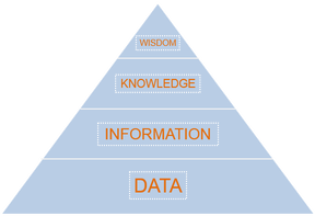
The success of a data visualisation should always be judged on whether it has had its intended impact on its audience. This usually equates to the successful transformation of data into wisdom. An understanding of Data Science and Statistics can help us turn our data into information. However, it is turning information into knowledge that I believe is the most challenging and important aspect of the journey from data to wisdom. Information is presented as pixels/ink on a screen/page while knowledge and wisdom are found in the overwhelmingly complex interplay between the 90bn+ neurons in the human brain. Through studying Psychology I aim to develop my understanding of how to bridge this gap from information to knowledge so that I can develop my understanding of what makes an effective data visualisation. The 2 aspects of Psychology that most directly relate to data visualisation are perception and cognition: Perception (noun) “the ability to see, hear, or become aware of something through the senses.” Cognition (noun) “the mental action or process of acquiring knowledge and understanding through thought, experience, and the senses.” Human beings are a highly visual species. Sight is the sense that most strongly influences, not only how we see the world, but also how we think about and try to understand it. This is the simple reason why creating visualisations is the most effective way to communicate with data. Through studying Psychology, I aim to learn more about perception as the first stage of interpreting any data visualisation. The next stage involves extracting information from that visualisation in order to turn it into knowledge. A fully functioning optic system will have no problem presenting our minds with the visual image of a chart or a table, but what cognitive processes take place to allow us to interpret and understand what we are perceiving? Studying cognition is therefore fundamental to understanding how we can best turn information into knowledge. One of my main objectives in studying Psychology is to better understand the complex processes and interactions that occur within our perceptual and cognitive systems when we are presented with a data visualisation. People are Always More Important than Technology...In an increasingly data-driven world, it is important to remember that people are always the most important aspect of any process. People’s habits and ideas are also the most difficult thing to change. Through studying Psychology, my ambition is to further my understanding of people. I want to know more about how we see, think and communicate so that I can apply this knowledge to the challenge of how to effectively communicate within our data-driven world.
Better technology will not provide the solution to this challenge. Only Psychology can provide the answers to the big questions in data visualisation. ______________ If you’d like to know more then please consider attending or hosting one of my workshops (see events) and please don’t hesitate to get in touch if you have any questions or comments. I can’t remember where I first heard this quote but it’s one of the most useful tips I’ve ever received. I regularly find myself passing this pearl of wisdom on to anyone who will listen and if you’re reading this then I want you to remember it as well. The operating system of the human mind is highly visual. If I were to ask you to think of a pink elephant, you will likely create a kind of faint impression of a pink elephant within your mind and this impression will be very much visual rather than verbal or auditory. However, while our minds and thoughts tend to operate visually, too often we rely solely on verbal language when communicating our ideas and this often leads to unnecessary misunderstandings. Sketch your ideas Before any report or data visualisation is developed, you first need to understand the requirement. How clearly that requirement can be defined plays a huge role in how effective the final product will be. Even at this early stage in our design process you can improve communication by creating images to share ideas. Now you may be thinking that creating a visual representation of your ideas is too time consuming. However, it really doesn’t have to be and my advice here is to “sketch, sketch, sketch”. This approach was initially inspired by a presentation I saw a few years ago by Nigel Hawtin (see http://nigelhawtin.com/). Sketching is quick and easy and you won’t become attached to your first drafts in the same way that you would if you’ve spent ages pulling a visualisation together using an IT tool. Using a pencil and paper it can take a matter of minutes to turn your ideas into images that will help both you and your audience to better understand and agree your requirements. Building on this shared understanding, your drawings can become the foundation of your design as they go through multiple iterations. Eventually you'll find them coming to life with real data as you build the final visualisation in your chosen IT tool. I'll be honest, I can’t draw. My artistic expression is limited to scribbles and stickmen, but that’s fine. As the old Chinese proverb says “a picture is worth a thousand words”. Over the years, I’ve found my child-like sketches to be an invaluable part of my process for agreeing reporting requirements and designs. So remember the wisdom of Steve Jobs - if you want to get your message across quickly and clearly then don’t just ask people what they want, show them what they can have. 
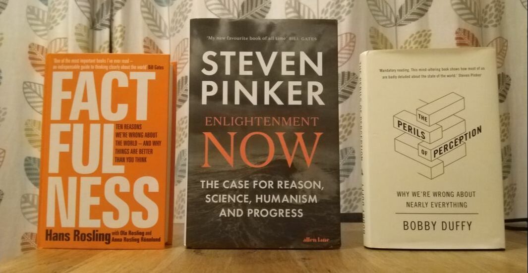
There are several common themes running across these 3 fantastic books. I think they represent an important pivot in (a) the way we human beings understand ourselves and (b) how communities, organisations and nations can be better governed/ organised. I would summarise this grandiose claim into 3 central ideas:
I also love how these books all lead with the data and use simple, highly effective visualisations to powerfully illustrate their ideas. 
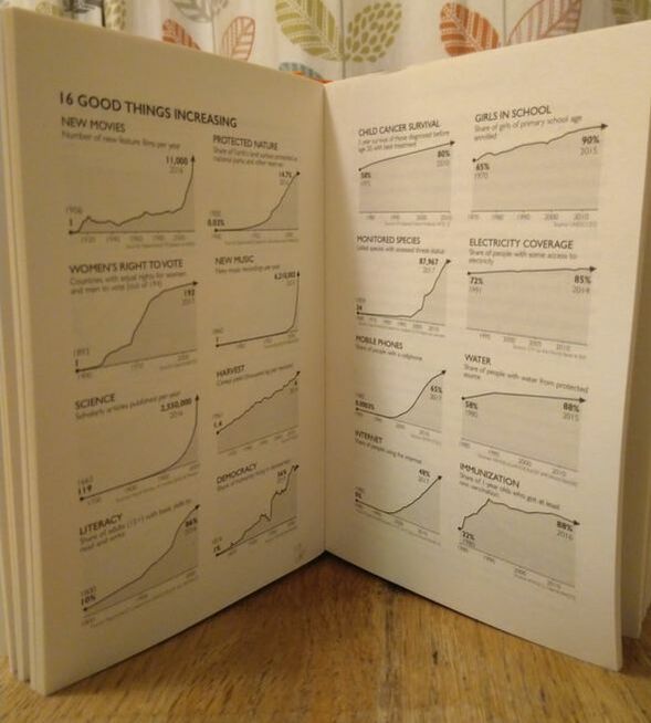
I highly recommend these books to anyone. If you have any thoughts you’d like to share or if you have any related recommendations for me then please get in touch.
I thought it might be helpful to provide a quick concrete example of good data visualisation practice. Following my last post, my mind naturally returned to the topic of pigeons and, amazingly, a quick Google search threw up a useful example. The following donut chart comes from www.londonpidgeons.co.uk and I think it provides a useful case study of some of the simple changes that can be made to allow a data visualisation to more effectively communicate its message 
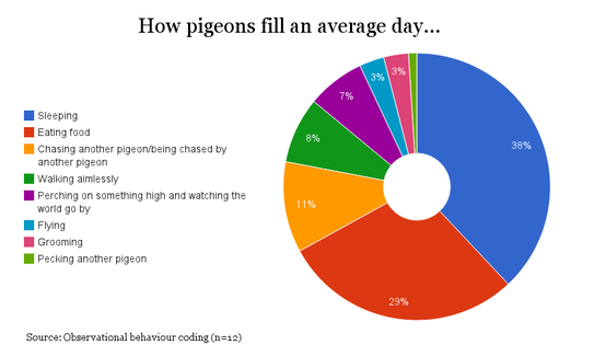
Issues with this visualisation include:
I’ll admit that I may be taking this pigeon analysis a bit too seriously, however, it is still the case that a simple bar chart would have communicated this information much more effectively. To make my point I created the following in Google Sheets in about 2 minutes: 
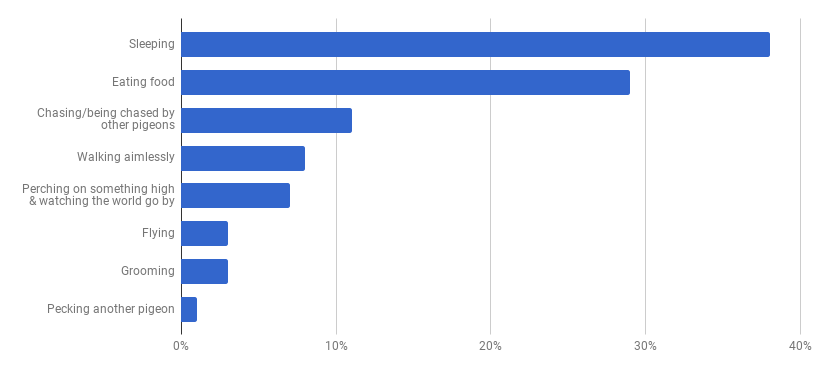
At first glance you may think that this doesn’t have the same visual appeal as the donut, however, our objective is communication and you can certainly read the data much more clearly in this bar chart than you could from the donut chart above. The 2 simple reasons for this are:
Nothing is a given in data visualisation though and so if you disagree then please get in touch. The benefits of effective data visualisation can be substantial. My concern is that good practice is often just equated with use of the latest tools. Flashy visual gimmicks are usually a distraction from our ultimate aim. Q: What should our ultimate aim be when creating a data visualisation? A: An efficient presentation which effectively communicates its intended message. So the purpose of data visualisation is communication. With this in mind, let’s consider the purpose of communication and cut that back to basics. Q: How do we effectively communicate our intended message? A: By clearly stating and presenting the message in a way that your audience can understand. This isn’t rocket science, but when we consider what constitutes effective communication, it is certainly not the tools we use that come to mind. Whether we are communicating verbally, by phone, by e-mail or using a carrier pigeon, it is the form and content of the message that determines whether it will be clearly understood by its intended audience. While we need to understand how to use our tools, it is not the tools that determine the quality of our message. Carrier pigeon (not actual size) Back to data visualisation and the same applies. In order to communicate effectively with data, we need to know our tools but, most importantly, we need to know how to communicate our message.
Writers like Edward Tufte, Stephen Few and Alberto Cairo have provided great insight into the cognitive aspect of data visualisation. Their ideas aren't well-known outside the field and even amongst data visualisation practitioners, they are often neglected. I’d like to change that. I’m fascinated by the psychological aspect of data visualisation. If we are going to communicate our message effectively then we need to understand how our audience will perceive and comprehend the information that we present to them. Data visualisation is the front line between data and decision making We should be aiming to make the transition of information from page/screen into our readers’ brains as seamless as possible. To do this well, we all need to know the science and psychology behind effective data visualisation. Some examples:
Tools like Excel, Tableau, Qlik, Cognos or Power BI and languages like D3, R or WebGL will allow you to create a vast array of different visualisations but they will never be able to tell you how to most effectively communicate your message. Data visualisation tools and languages are constantly evolving and it is obviously important to know your tools and to be aware of technical developments within the field. However, this will always be secondary to knowing the value of, and methods behind, effective communication and so I’d encourage everyone to find out as much as they can about the theory behind their craft. If you’d like to know more then please get in touch! I read a lot! I also keep a spreadsheet which lists and grades the 120+ books I’ve read since June 2015 and have written up detailed notes about my favourite reads. I’m well aware of how sad this makes me. I’ve read many of the leading texts about data visualisation; Stephen Few, Edward Tufte and Alberto Cairo are my top 3 inspirations here. However, what I enjoy most is reading about people and trying to understand why we behave the way that we do. To this end, I read a lot about psychology and related fields. To give you an idea of what I’ve read, take a look at the top of this page to see the“recently read” section of my bookcase. If I were to select one book that I think everyone should read it would be Thinking Fast & Slow by Daniel Kahneman. This book has taught me so much about human behaviour and why people are not as rational as they like to think they are. The insight I’ve gained from this book is hugely relevant to a vast range of subjects and practices. One of my main goals is to spread Daniel Kahneman’s word amongst Analysts, Accountants, Researchers, and anyone else working with data visualisation. 
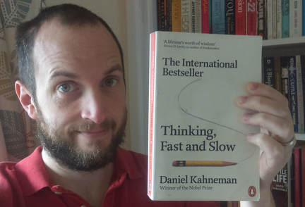
After Daniel Kahneman, I’d recommend pretty much anything by Steven Pinker.
As a final thought, I also like to read fiction when I can find the time. My all-time favourite novel is probably Jonathan Franzen’s Freedom. I’d find it hard to explain why I love this book so much but it contained such brilliant, relatable, yet tragic personalities. I found it to be as effective an exploration of human behaviour as any work of nonfiction. Other writers I love include John Irving, Mark Haddon, Matt Haig and Hanya Yanigihara. I’m always looking for inspiration on what to read next so please get in touch if you have any ideas for me. |
ABOUT MEAll content & opinions are those of the author Archives
March 2025
Categories |